So the milky bar kid has asked me to draw 3 portraits, A4, lead pencil, of Neo, Trinity and Morpheus! Trinity is done! And i think it looks rather smashing! He has told me that he does not mind if it is posted on this blog so I will do so! But I will probably wait till all of them are done to make him wait! :P Also! I shall do a blog for those who wish to enquire about purchasing a requested portrait or art of some other form. Prices are very negotiable and I don't charge much!
Take care! xo
Friday, June 4, 2010

Monday, May 31, 2010
~Basic drawing tips~
H e l l o
Okay so when someone says "teach me to draw!" my heart sinks a little because of the sheer stupidity of the request. it comes close to "DRAW ME" in terms of comparison in that it makes me suicidal! Then there's those who sarcastically say it thinking it is witty and original when in fact it's more common than the serious ones. ANYWAY!
NUMBER ONE
O u t l i n i n g
When you are drawing ANYTHING you want to start with a feint outline to give some shape and definition to your piece. This is essential in still life drawing or portraits as well as landscape drawing. It is like perfecting your image before you even start shading or colouring! Okay so you COULD use the pencil you draw with and just press lightly but what would be better is to actually use a harder pencil. I use a 6H or a 7H for outlines, any harder and it will just scratch the paper. These are great because they erase so easily. Even a HB which is generally considered the median of pencils can be a bitch to erase!
P a p e r
The type of paper you use can effect the quality of your drawing! You would be surprised how many people would never thing to use watercolour paper for watercolour pencils. I'm not even kidding! So few make the connection! If you take art a bit more seriously and like to paint, try buying a canvas pad. They're cheap have a great texture and because the pages are similar to that of a real canvas, it dries a hell of a lot quicker!
B l a c k
DON'T BE AFRAID OF GOING DARK! I saw the Year 11 portraiture and was stunned to see how light all of the drawings were! Pressing hard with a HB is feeble compared to a 5B! Especially on eyes! Make the pupil as black as you can and leave the eye whites as blank as possible! Darkness ads unfathomable depth to a piece! Look at my Oprah drawing (my first of the series) and then Brad Pitt! I used a 7B for most of Brad and you can see the improvement!
B l e n d i n g
I am usually fickle about blending with my finger but sometimes on large areas of skin I tend to do so. A smudge stick costs about 20c and is a great tool for controlled blending and smudging. The worst part of using your finger is that every time you touch the paper you will leave a fingerprint which is a bitch to get rid of later down the track
M i s t a k e s
If you are a perfectionist like myself, DEAL WITH IT! Everyone makes mistakes. As long as you have a quality eraser shouldn't be that bigger deal. trial and error is the best way to improve!
H a r s h R e a l i t y
Sadly, some people cant draw to save their life and shouldn't be allowed to hold a pencil. But you shouldn't aim to be like that kid in your art class that you hate because of their talent. Everyone has their own strengths so stick to them but don't be too close minded. It's kind of like singing, you either can or you can't but maybe training or practise can make you a little better.
Have a good one guys! xo
Okay so when someone says "teach me to draw!" my heart sinks a little because of the sheer stupidity of the request. it comes close to "DRAW ME" in terms of comparison in that it makes me suicidal! Then there's those who sarcastically say it thinking it is witty and original when in fact it's more common than the serious ones. ANYWAY!
NUMBER ONE
O u t l i n i n g
When you are drawing ANYTHING you want to start with a feint outline to give some shape and definition to your piece. This is essential in still life drawing or portraits as well as landscape drawing. It is like perfecting your image before you even start shading or colouring! Okay so you COULD use the pencil you draw with and just press lightly but what would be better is to actually use a harder pencil. I use a 6H or a 7H for outlines, any harder and it will just scratch the paper. These are great because they erase so easily. Even a HB which is generally considered the median of pencils can be a bitch to erase!
P a p e r
The type of paper you use can effect the quality of your drawing! You would be surprised how many people would never thing to use watercolour paper for watercolour pencils. I'm not even kidding! So few make the connection! If you take art a bit more seriously and like to paint, try buying a canvas pad. They're cheap have a great texture and because the pages are similar to that of a real canvas, it dries a hell of a lot quicker!
B l a c k
DON'T BE AFRAID OF GOING DARK! I saw the Year 11 portraiture and was stunned to see how light all of the drawings were! Pressing hard with a HB is feeble compared to a 5B! Especially on eyes! Make the pupil as black as you can and leave the eye whites as blank as possible! Darkness ads unfathomable depth to a piece! Look at my Oprah drawing (my first of the series) and then Brad Pitt! I used a 7B for most of Brad and you can see the improvement!
B l e n d i n g
I am usually fickle about blending with my finger but sometimes on large areas of skin I tend to do so. A smudge stick costs about 20c and is a great tool for controlled blending and smudging. The worst part of using your finger is that every time you touch the paper you will leave a fingerprint which is a bitch to get rid of later down the track
M i s t a k e s
If you are a perfectionist like myself, DEAL WITH IT! Everyone makes mistakes. As long as you have a quality eraser shouldn't be that bigger deal. trial and error is the best way to improve!
H a r s h R e a l i t y
Sadly, some people cant draw to save their life and shouldn't be allowed to hold a pencil. But you shouldn't aim to be like that kid in your art class that you hate because of their talent. Everyone has their own strengths so stick to them but don't be too close minded. It's kind of like singing, you either can or you can't but maybe training or practise can make you a little better.
Have a good one guys! xo
Tuesday, May 25, 2010
I've been a bit lazy!
Wow I havent blogged in ages! I am just a bit useless! To be honest I havent had a lot to blog about recently! My major piece is giving me a bit of troulbe in terms of actually decideding what its going to look like. I have a general idea I think the whole perfectionist thing is coming into play. I guess its still in the development stages so I cshouldnt be so hard on myself! Anyway, I shall start Tyra Banks tomorrow which will be the last celebrity, then its onto my school chaps! I am rather excited! I actually just had a good idea for a blog! So I might do that in my lack of spare time! Just to remidn myself its about all the different types of PAPER! YAY! I promise Ill have a picture of Ryan Reynolds soon!
Sunday, May 9, 2010
BACK UP WORK
Okay this blog has been a difficult and long process so you better like it!
Okay now in Year 12 Art, both Practical and studies, students have to create two major art works. These are accompanied by a backup folder, which is essentially 50 A3 pages of ideation, development, practicing, media exploration and all sorts. This is generally the most tedious part of the subject. Most of the marks are actually focused around this work so doing it well is very important!
Ive comprised some tips on how to make backup work more aesthetically pleasing as well as worthy of more marks! So if you're an art student this will be helpful, if not then... why are you on here? JOKES <3
T I T L E S
No matter what you're doing you should have a title on your page. It makes it easier to identify and adds clarity to your work. It shows that you actually know what you are developing. Here are some examples of titles that I have done, where I have gone that little bit further which I will explain later on.
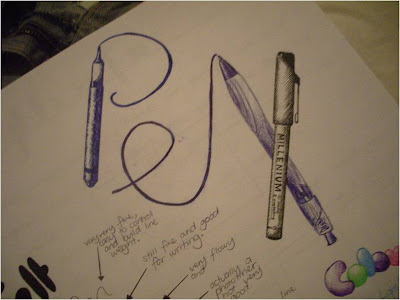
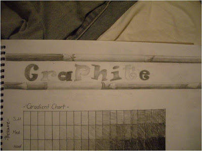
These are both examples of how what would ordinarily be dull pages with a lack of colour, but if you spend a little time on the title it can completely change the way the page looks. All I have done here is used the medium to fancy it up a bit. Pencils are easy to draw so its not really that difficult. The PEN title is a little more complex but if you're feeling ambitious then give it a try. Even if the title is in fancy writing it will still give a nice look to the page, and REMEMBER! It doesn't have to be in the top left corner!
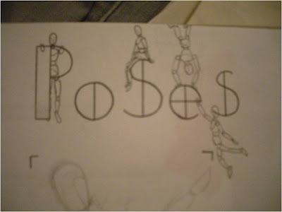
This was a page where I used my mannequin to make some poses for future use. I just drew a few more little ones around the word Poses which is simply written, and it completely changes the dimension of the word.
R E F E R E N C E S
Okay so say you have done a bunch of pictures and you want to write down what colours you have used. this is how I do it.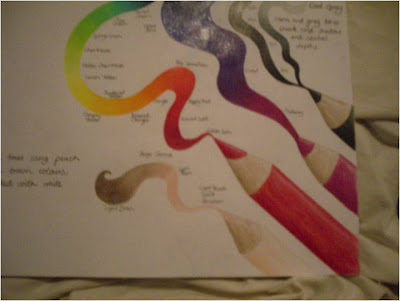
Completely ridiculous and borderline pretentious BUT it give it that look that actually makes people jealous of your work! And why wouldn't you want that?! It is those individual touches that give your pages that BAM!
R E C Y C L I N G
50 pages is A LOT! And it is hard to fill! So use everything! Even scribbles on paper or when you test a colour! You may remember when I first drew Brad Pitt! Well look where it is now!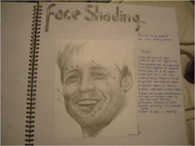
This is a great idea to fill up some pages! Even sticking different types of paper in and writing a bit about them is good! This leads onto my next section
W R I T I N G
NOW everything you draw or stick in, you should write about. Say what it is, what you like about it and what you don't. This is an ESSENTIAL part of backup work. Now I suggest that if you want to keep it from looking messy, either rule feint lines first then erase later, or if you're bored then do this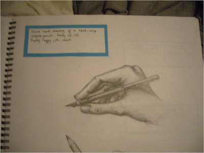
This is very time consuming but creates the illusion of a page being fuller than it actually is!
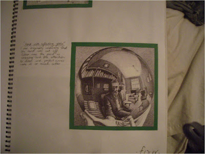
The opposite is if you have stuck something in in the same fashion, then write on the paper. This is where I have talked about another artists work, which also gets big marks!
G E T M O D E L S
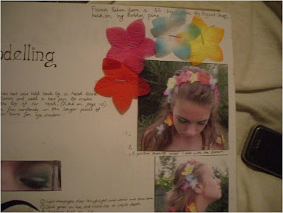
Getting people to model for you is another mark booster! I got a friend to pose for my mother nature section of my major. I used flowers from a cheap-shop lei and pinned them in her hair to simulate real flowers. I then stapled the actual flowers to the page. Taking your own pictures is MUCH better than using net images.
E X T R A S
Using paint in your book can be detrimental to appearances if you are using both the left and right paint. I only use the right page! Anywho for some paint experimentation, I bought a canvas panel and stuck it in with tape! Its much tidier!

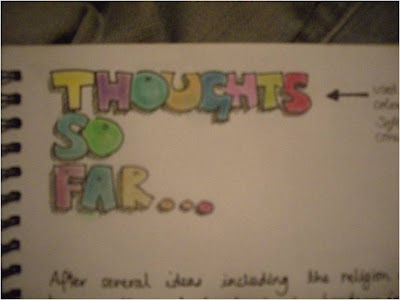
ALSO if you feel that your book has become too confusing and perhaps lacking obvious direction, do a THOUGHT SO FAR page! This is also great for marks!
THANKS FOR READING!
Okay now in Year 12 Art, both Practical and studies, students have to create two major art works. These are accompanied by a backup folder, which is essentially 50 A3 pages of ideation, development, practicing, media exploration and all sorts. This is generally the most tedious part of the subject. Most of the marks are actually focused around this work so doing it well is very important!
Ive comprised some tips on how to make backup work more aesthetically pleasing as well as worthy of more marks! So if you're an art student this will be helpful, if not then... why are you on here? JOKES <3
T I T L E S
No matter what you're doing you should have a title on your page. It makes it easier to identify and adds clarity to your work. It shows that you actually know what you are developing. Here are some examples of titles that I have done, where I have gone that little bit further which I will explain later on.


These are both examples of how what would ordinarily be dull pages with a lack of colour, but if you spend a little time on the title it can completely change the way the page looks. All I have done here is used the medium to fancy it up a bit. Pencils are easy to draw so its not really that difficult. The PEN title is a little more complex but if you're feeling ambitious then give it a try. Even if the title is in fancy writing it will still give a nice look to the page, and REMEMBER! It doesn't have to be in the top left corner!

This was a page where I used my mannequin to make some poses for future use. I just drew a few more little ones around the word Poses which is simply written, and it completely changes the dimension of the word.
R E F E R E N C E S
Okay so say you have done a bunch of pictures and you want to write down what colours you have used. this is how I do it.

Completely ridiculous and borderline pretentious BUT it give it that look that actually makes people jealous of your work! And why wouldn't you want that?! It is those individual touches that give your pages that BAM!
R E C Y C L I N G
50 pages is A LOT! And it is hard to fill! So use everything! Even scribbles on paper or when you test a colour! You may remember when I first drew Brad Pitt! Well look where it is now!

This is a great idea to fill up some pages! Even sticking different types of paper in and writing a bit about them is good! This leads onto my next section
W R I T I N G
NOW everything you draw or stick in, you should write about. Say what it is, what you like about it and what you don't. This is an ESSENTIAL part of backup work. Now I suggest that if you want to keep it from looking messy, either rule feint lines first then erase later, or if you're bored then do this

This is very time consuming but creates the illusion of a page being fuller than it actually is!
The opposite is if you have stuck something in in the same fashion, then write on the paper. This is where I have talked about another artists work, which also gets big marks!

G E T M O D E L S
Getting people to model for you is another mark booster! I got a friend to pose for my mother nature section of my major. I used flowers from a cheap-shop lei and pinned them in her hair to simulate real flowers. I then stapled the actual flowers to the page. Taking your own pictures is MUCH better than using net images.

E X T R A S
Using paint in your book can be detrimental to appearances if you are using both the left and right paint. I only use the right page! Anywho for some paint experimentation, I bought a canvas panel and stuck it in with tape! Its much tidier!

ALSO if you feel that your book has become too confusing and perhaps lacking obvious direction, do a THOUGHT SO FAR page! This is also great for marks!

THANKS FOR READING!
Wednesday, May 5, 2010
8th portrait - Jeffrey Donovan

Guy from Burn Notice. Done in black Prismacolor pencil.
The top of the hair will be cut off for a border if you were wondering! He did have a goatee bit it was disgusting so I got rid of it!
Monday, May 3, 2010
7th Portrait - Brad Pitt

Bad quality photo taken in yellow light. Probably sounds like an excuse but meh!I think it looks like him...
Sunday, May 2, 2010


Saturday, May 1, 2010
This Week
Hey guys! Lately I'm very up to date with all my homework and assignments. SO what I will be doing this week is working on a long blog post about how to make backup work presentable and how to give it that creative flare that so many people want but are perhaps to lazy to do. So this week I plan to give a few hints on making the usually drab and boring process of backup work a little more colourful.
Friday, April 30, 2010

Nostalgia
Hey lolcats my 7th portrait is underway! Brad Pitt-my second attempt. it is still in lead pencil. The lips are proving difficult and the eyes took a lot of work to make them look BradPittyish. I will upload it as soon as I've finished :) Catch ya!
Tuesday, April 27, 2010

Friday, April 23, 2010

Tuesday, April 20, 2010
Derwent Graphic 24 Pencil Set Review
Hey there! Today I will be doing my first official review of a product!
So recently in Harbour Town I waled past an art store which must have had a forgettable name as I can't recall. I have been looking for a quality set of graphite pencils for quite some time now since I sold my first piece :) Because of their limited range I went with Derwent as it was the most expensive, I kid! The other was Monte Marte which are very average in general.
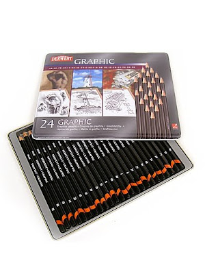
It cost $34.95 so obviously that was an absolute rip off but I still payed for it regardless. Okay well the tin is well presented and tells you exactly whats in there so that's a good thing! It contains 9H 8H 7H 6H 5H 4H 3H 2H H F HB B 2B 3B 4B 5B 6B 7B 8B 9B and the following had doubles; 2H HB 2B and 4B. This is convenient as they are commonly used shades. I found that the pencils have that strange quality that makes people jealous, as though they want the same pencils as you. Its a strange feeling..never mind. Okay well the 9H and 8H were very scratchy as the leads are so hard, they are borderline useless but that is Derwent's fault. at 7H they become smoother and they no longer damage the paper. F is an unusual pencil because it obviously don't fit into the whole letter system but basically its a well rounded pencil for writing or sketching. The Bs are brilliantly smooth and once you get to 5B or so the coverage and blackness becomes well worth the price...almost?
My rating: 9/10
So recently in Harbour Town I waled past an art store which must have had a forgettable name as I can't recall. I have been looking for a quality set of graphite pencils for quite some time now since I sold my first piece :) Because of their limited range I went with Derwent as it was the most expensive, I kid! The other was Monte Marte which are very average in general.

It cost $34.95 so obviously that was an absolute rip off but I still payed for it regardless. Okay well the tin is well presented and tells you exactly whats in there so that's a good thing! It contains 9H 8H 7H 6H 5H 4H 3H 2H H F HB B 2B 3B 4B 5B 6B 7B 8B 9B and the following had doubles; 2H HB 2B and 4B. This is convenient as they are commonly used shades. I found that the pencils have that strange quality that makes people jealous, as though they want the same pencils as you. Its a strange feeling..never mind. Okay well the 9H and 8H were very scratchy as the leads are so hard, they are borderline useless but that is Derwent's fault. at 7H they become smoother and they no longer damage the paper. F is an unusual pencil because it obviously don't fit into the whole letter system but basically its a well rounded pencil for writing or sketching. The Bs are brilliantly smooth and once you get to 5B or so the coverage and blackness becomes well worth the price...almost?
My rating: 9/10
Tuesday, April 13, 2010

Monday, April 12, 2010
Tips for using charcoal
Hey guys its been a long time since I've blogged and to anyone who religiously reads this -if any- I apologize. So previously I blogged about how to use graphite effectively. This time it will be about charcoal.
There are 4 main types of charcoal.
Compressed
Willow
Pencil
White
Compressed
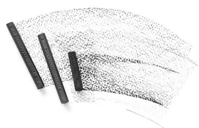
Generally comes in Soft, Medium and Hard. The softer sticks come out darker because more carbon is loaded onto the paper. These are great for covering large areas quickly, but smudge easily and less control is the result. Because the coverage is even it is easier to erase.
Willow
This is a useless and unfavourable charcoal so I can not be bothered talking about it.
Charcoal Pencil
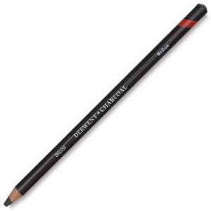
My personal favourite because of the control it offers. They can be sharpened just like normal pencils. They are great for crisper lines and also come in soft, medium and hard. They can be smudged using a smudge stick and blended out using pressure to create a gradient.
White Charcoal
They aren't actually charcoal at all. Charcoal is mostly carbon and these are made from calcium carbonate, which is chalk! These are good for eye whites and highlighting but only use in larger scales if the paper is a darker colour. For example white charcoal looks great on black paper.
Eraser Putty
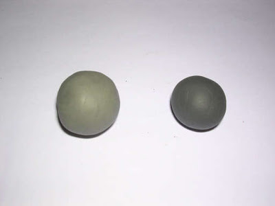
I actually have no idea what it is made from, but it comes in a range of colours, and the picture shows how it can gradually pickup charcoal particles, so it's best to replace it every so often. If they dry out they can become shitty and leave a residue on the paper which prevents more charcoal from sticking to the paper. It can be used for graphite but then again most people have a regular eraser anyway.
~Tips~
-Keep one hand clean and one dirty, so you can move the paper without excess smudging
-If you are right handed work from the left top corner to avoid smudging and if you are left handed work from the right top corner.
-Use a pencil for fine lines and corners
-Refrain from using white charcoal to highlight, the putty eraser is a better option
-Always have a smudge stick when using charcoal for controlled blending
-Take off any rings or bracelets before drawing as they may indent the paper permanently leaving it white.
-Wash and dry hands periodically
Have a good one guys! xo
There are 4 main types of charcoal.
Compressed
Willow
Pencil
White
Compressed

Generally comes in Soft, Medium and Hard. The softer sticks come out darker because more carbon is loaded onto the paper. These are great for covering large areas quickly, but smudge easily and less control is the result. Because the coverage is even it is easier to erase.
Willow
This is a useless and unfavourable charcoal so I can not be bothered talking about it.
Charcoal Pencil

My personal favourite because of the control it offers. They can be sharpened just like normal pencils. They are great for crisper lines and also come in soft, medium and hard. They can be smudged using a smudge stick and blended out using pressure to create a gradient.
White Charcoal
They aren't actually charcoal at all. Charcoal is mostly carbon and these are made from calcium carbonate, which is chalk! These are good for eye whites and highlighting but only use in larger scales if the paper is a darker colour. For example white charcoal looks great on black paper.
Eraser Putty

I actually have no idea what it is made from, but it comes in a range of colours, and the picture shows how it can gradually pickup charcoal particles, so it's best to replace it every so often. If they dry out they can become shitty and leave a residue on the paper which prevents more charcoal from sticking to the paper. It can be used for graphite but then again most people have a regular eraser anyway.
~Tips~
-Keep one hand clean and one dirty, so you can move the paper without excess smudging
-If you are right handed work from the left top corner to avoid smudging and if you are left handed work from the right top corner.
-Use a pencil for fine lines and corners
-Refrain from using white charcoal to highlight, the putty eraser is a better option
-Always have a smudge stick when using charcoal for controlled blending
-Take off any rings or bracelets before drawing as they may indent the paper permanently leaving it white.
-Wash and dry hands periodically
Have a good one guys! xo
Sunday, April 4, 2010
Marylin Manson Portrait
So here is the picture of Manson. He doesn't float my boat but I think it turned out okay. :D
Medium-Prismacolor (Black)

Medium-Prismacolor (Black)

Saturday, April 3, 2010
Blog
Hello. It's been a while since I've posted anything. I'm feeling rather uninspired today, maybe I'm tired I don't know. I am currently in the early stages of drawing Leona Lewis. I have done the eyes lips and some of the skin. Her skin is a strange mocha colour so it;s proving hard to replicate. More than likely progress pics will be up soon. and Marylin is finished so pictures of that too! I think its my best so far... maybe? xo
Thursday, March 25, 2010
Failed Picture :\
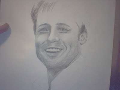
When one is drawing, they must remember that mistakes are essential if you ever want to improve. I was told by over 500 billion people that my picture of Jensen Ackles is my best, however that was a take two-so to speak. I was unique in the fact that I hated my first one which was done in charcoal. I made around 3 mistakes that was very obvious. I felt as though I could not continue ANYTHING until i was happy, and to many peoples disbelief i started again. Turned out it wasn't a foolish decision after all. Be prepared to make errors and use a high quality eraser :) This is a "failed" picture of what is meant to be Brad Pitt. I still think it looks like a man, and I was satisfied with the shading, but SOMETHING is off. Anyway I am currently drawing a picture for a friend of Marylin Manson. I think it may be one of my best works but we shall see. Im not going to do update pics of it because I want to surprise her!

A little piece of backup work
No matter how many angles I take of this, or what lighting, the quality is SHIT. Maybe its my 1.3 megapixel phone camera... UNLIKELY! Any who its a picture of an old hand holding a water lily bloom, showcasing contrasts of life and not so living as well as mixed media techniques.


Sunday, March 14, 2010
A proper blog has writing.
So it’s been a while since I actually blogged about anything in a while, more a less pictures that I have drawn, which is what I assume most would prefer to see. However there are a few things I’d like to journal.
Lately I’ve received much praise for my art, and I now see myself pursuing it as a career. I want to one day teach art, as well as sell art, and hopefully deservedly call myself my an artist. When someone compliments my work, it not only do I appreciate it, it gives purpose to picking up the pencil in the first place. After recent offers to do pieces for significant amount of money, I feel some reassurance that my abilities can one day, take me places. If on that day, “a Brandon Symes original” means something, I will feel accomplished.
Thank you to anyone who took the time to view my blog, or let alone, read this.
Lately I’ve received much praise for my art, and I now see myself pursuing it as a career. I want to one day teach art, as well as sell art, and hopefully deservedly call myself my an artist. When someone compliments my work, it not only do I appreciate it, it gives purpose to picking up the pencil in the first place. After recent offers to do pieces for significant amount of money, I feel some reassurance that my abilities can one day, take me places. If on that day, “a Brandon Symes original” means something, I will feel accomplished.
Thank you to anyone who took the time to view my blog, or let alone, read this.
Subscribe to:
Posts (Atom)

